Finished my 42''x36'' poster today (turns out 2.671, my Measurement and Instrumentation class, didn't want A0). I saw some awesome horizontal and vertical designs Tuesday, and now I have this super-cluttered and not very aesthetically pleasing poster *sigh* Oh well. I liked my draft version better for its simplicity and think I have too much text on this final version.
 |
| Larger size PNG image available on dropbox, |
Again, thanks to Alexander Erlich for the Inkscape template
Also, thanks to netalloy for the coffee cup vector
And thanks to OnlyPositive for the picture of the sleepy cat.
And thanks to OnlyPositive for the picture of the sleepy cat.
Google Docs
Spreadsheet here. I calculated averages and stddevs with =AVERAGE( ) and =STDEV( ) respectively, and turned formatted time (e.g. 07:30:00) into decimal hours (e.g. 7.50) (also applied Format > Number > Two decimals) using the formula =INT(F4)*24+HOUR(F4)+MINUTE(F4)/60
Here is the matlab code I used. It's very messy and I don't actually understand what it means. In fact, I had to do post-processing of the Matlab > Export Setup > Rendering, Resolution = 300 > Export > figureN.png in the GIMP prior to dropping it in Inkscape to get the images I wanted.
figure
caffeine4=[0 0 0 0 0 0 0 0];
sleep4=[6.95 10.87 9.75 7.52 10.95 9.43 8.75 10.23];
day=[25 26 27 28 29 30 31 32];
[AX,H1,H2] = plotyy(day,sleep4,day,caffeine4,'plot');

title('Phase 4: Daily Hours Slept and Caffeine Intake');
xlabel('Date (in April)');
%xlim([26 13]);
set(gca,'XTick',25:1:32);
%set(gca,'box','off');

set(get(AX(1),'Ylabel'),'String','Amount Slept Daily (hrs)');
set(get(AX(2),'Ylabel'),'String','Daily Caffeine Intake (mg)') ;
axis(AX(1),[25 32 0 11]);
axis(AX(2),[25 32 0 700]);
set(AX(1),'YLim',[0 11], 'YTick',0:1:11, 'box','off');
set(AX(2),'YLim',[0 700],'YTick',0:100:700,'box','off', 'box','off');

set(H1,'LineWidth',3,...
                'MarkerSize',7,...
    'LineStyle','-',...
    'Marker', 'o',...
    'MarkerEdgeColor', 'none',...
    'MarkerFaceColor', 'b');
set(H2,'LineWidth',3,...
                'MarkerSize',7,...
    'LineStyle','-',...
    'Marker', 'o',...
    'MarkerEdgeColor', 'none',...
    'MarkerFaceColor', 'g');
Above code resulted in this graph:
This data was actually 25 April to 2 May, but instead of learning about timeseries in MATLAB, I just cheated and stuck "April / May" in the xlabel and used 31 and 32 to not break my code. I planned to post-process in gimp to turn "31 32" into "1 2" but forgot to do so.
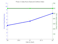
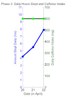
For phase 3, I couldn't figure how to get rid of the 20.5 and 21.5 tick marks when I expanded to graphs to reasonable size, so I did post-processing in GIMP. Here are the two images I smushed together into the third:
 +
+ =
=
Using "shift-J" in Vim to turn newlines (ctrl-click-drag to get a column of values from google doc separated by newlines) into spaces, which Matlab uses to delimit vector data.
Making Instagram-like effect with kitten in top-left corner via kitten > right-click Add layer mask > (1) Gradient tool white-to-back, radial, click-drag from center to slightly past edges of images. This transparency-ed a large part of the cat face so (2) Ellipse select most of cat face, Gradient tool white-to-light-gray, radial, click-drag from center to edge of ellipse.
Inkscape, Filter effect > Make arrowheads match color to the lines. (If you decide to change the color of the arrowheads).

No comments:
Post a Comment